
By: Ron B. Wilson
Whether you are more comfortable floating thousands of miles above breathtaking natural formations, wandering down ancient cobblestone streets with a loved one, or somewhere in between, looking at advertisements in high-end travel magazines these days will make you want to immediately stop what you are doing, and run to the closest airport to get away to an exotic location! Contrasting advertisements selling the same product can catch the attention of a single audience, but typically they are created to entice completely different kinds of people. Travelers who prefer to vacation in rural areas and those who enjoy visiting a major metropolitan city are targeted in varied ways. One company, Turkish Airlines, effectively markets to different types of customers. The two advertisements presented here are designed to promote the same business, but each will certainly appeal to different types of viewers because they use very different kinds of images and text.
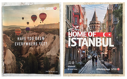
The first advertisement targets adventurous travelers. At first glance it could be anywhere really, possibly in the American West. Once your eye makes it’s way around the entire page several times taking in all of it’s beauty, you finally notice the very small type that says “Cappadocia, Turkey” at the bottom of the page. Most people won’t think of Turkey when they see images of hot air balloons hanging in the warm yellow sky in a spectacular sunrise over cascading mountainous terrain, the kind of thing reserved for only the brave and fearless visitor who is willing to take a risk. It’s when that you finally notice the slogan “have you been everywhere yet” that you realize even though you may have been to Turkey before, you probably have not seen the country in all it’s entirety, and until you have, you have NOT been everywhere.
The second advertisement targets traditional travelers. The designer of this ad has selected an interesting image of a romantic street scene. The couple strolling away affectionately, more than likely is discussing the awesomeness of this beautiful old street they have stumbled upon. Instead of using a more recognizable landmark of this major city with the mammoth Hagia Sophia in it, the creator chose to use an unexpected view of the city with daily life happening all around, and an unfamiliar castle. The image itself is almost perfect compositionally with leading lines drawing you into the action, colorful and unique buildings throughout, and a man and women walking away in the dead center. The photograph depicts a cool-blue, partly cloudy afternoon, probably midday when shopkeepers close up for lunch. The bold type reading “HOME OF ISTANBUL” with the red and whiteTurkish flag cutting through it tells you that this too is Turkey, and begs the viewer to come experience it for themselves.
The reader will notice many stark differences in both of these ads because the photographs are completely unalike. The first advertisement evokes a feeling of a seclusion on a special vacation in a wondrous location, hovering above natural beauty. The photograph was taken in the golden hour during a sunrise in central Turkey, therefore the toasty yellow tone is unforgettable. The flare from the streaming light coming in from the upper right hand corner makes you feel as if you’re there, part of the scene, and will appeal to adventurous globetrotters. The composition of the image is interesting and graphically appealing, as the sky in dotted with red, blue, and purple globes. Although the mountains are jagged, the contrast used in the image is rather soft and muted, projecting realness. The second ad brings to mind a sensation of excitement on a jam-packed trip in a bustling city center, where you might quickly duck into a cafe and grab a cappuccino on a street that a Roman soldier could have built more than a millennia ago. The cool tone of this image shifts the mood and meaning of the advertisement, and is a very powerful tool which plays a psychological factor in how the viewer internalizes it. The soft use of bluish color in this ad reveals the idea of a vintage selenium photograph from years past, that would attract a more conventional visitor. In this particular street scene the viewer is shown many surfaces, such as rusty metal gates, a rough stone street, multicolored textured buildings, and crowned by a pointy medieval castle which is this image’s anchor. Both photographs are compelling, and use techniques that are strong, impactful, and beautiful.
An important element to advertising is the use of graphics, wording and text. In the ballon ad the text is subtle, calm, compact and separated, giving the reader room to breath and take in the view. The words “widen your world” help tie the text to the imagine by inviting the reader to try something new and exciting. Compared to the impact of the graphics used in the city ad, where the larger font size hits the viewer like a freight train and reminds you that if you are the kind of traveler who likes to vacation in major cities, ISTANBUL will surely deliver. In this second ad there is a tagline that reads “goturkey.com”, which invites the viewer to research the idea of visiting one step further online. Both ads use of the company’s logo, which is a red and white circle with soaring wings within it’s border, and bold capitalized letters that read “TURKISH AIRLINES”, which seems very familiar and trustworthy. Both ads use captivating fonts, and the techniques are distinctive and professional.
Each of the advertisements analyzed above uses unusual visual elements with skill to grab the attention of their targeted audiences. Turkish Airlines uses smart techniques to advertise their product, which is basically a big metal tube. The closest glimpse the viewer gets to actually flying is in a weightless tranquil ballon, a long way away from a cramped vinyl seat complete with salty peanuts and stale beverages breathing recycled air. Although they both use similar white font styles and recognizable company logos, these advertisements vary in their plea to contrasting types of travelers. Adventure seekers are shown the warmth of sun flare, and wording that only hints that this is an advertisement. While people looking for a conventional vacation are invited inside to view a day in the life of a big city, still with enough room for personal space, where the text is unmistakably big, bold and unambiguous. Both ads successfully promote the same business while not only appealing to their intended audiences, but to a magazine’s entire readership.
